All About Printing Your Button Artwork: CMYK vs RGB March 29 2017
Designing button artwork takes some creativity with a just a little pinch of technical know-how. Many customers who order custom buttons inquire about the best file type for their button artwork, but another important aspect of button artwork is the colour space in which it was created.
This blog post is dedicated to colour spaces and what that means in relation to designing buttons :) Let's go!
WHAT IS A COLOUR SPACE?
A colour space is simply an organization or range of colours. You can think of a colour space as palette of all the colours available for you to work with. The two colour spaces that are most common when working in Photoshop or Illustrator are RGB and CMYK. What is the difference between the two? Quite a lot actually!

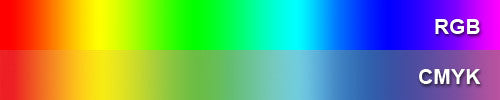
RGB COLOUR SPACE
RGB in an acronym for Red, Green, and Blue, and is the colour space used by electronic displays. You should be working in an RGB colour space if the final product is going to be presented digitally on a screen, like a picture that's going on a website. Every colour in an RGB colour space is made of some combination of red, green, and blue.
CMYK COLOUR SPACE
CMYK is an acronym that stands for Cyan, Magenta, Yellow, and Key (which is black). You should be working in a CMYK colour space if the final product is going to be printed, and not presented on a screen. The palette of colours that you can access in a CMYK colour space can all be made by mixing different amounts of Cyan, Magenta, Yellow, and Black, the colours of ink used by a printer.
WHY USE A CMYK COLOUR SPACE INSTEAD OF RGB FOR DESIGNING BUTTONS?
The colour spectrum in an RGB colour space is vast, however, many of the colours are NOT able to be reproduced by a printer. Why not? Because the colours are just not able to be created by the mixing Cyan, Magenta,Yellow, and Black together. It uses a different palette of colours entirely.
If you do try and print out a file that was designed in RGB, you'll notice that the colours look pretty different than they do on the computer. This is because the printer has to substitute all of the RGB colours that it cannot create with a combination of cyan, magenta, yellow, and black ink.
LET'S GET VISUAL
Below is an example of a button design that was created in RGB. The vibrant green on the screen looks bright and saturated. This is because the colours present in the design are made up of Red, Green, and Blue, and are also back lit on the computer.
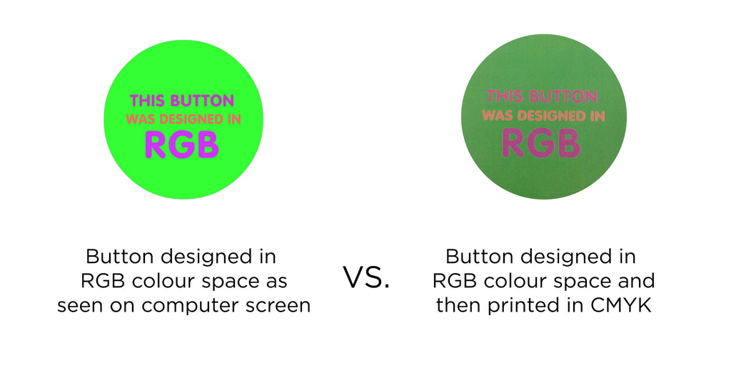 Beside the digital button artwork designed in RGB is the same button, the only difference is that it was printed out on a laser printer. The RGB colours were substituted to CMYK, and the final printed art looks really different because there is a different colour palette available.
The above picture sums up why it's important to design you button artwork in CMYK: you won't get any surprise colours!
BUT I REALLY WANT A NEON BUTTON...
|
Just because a nice vivid neon colour can't be printed out on a printer, doesn't mean that there aren't other ways to achieve a vibrant, striking button. A great way to achieve a neon look, is to print the button artowrk on a Dura-Lar transparency and pair it with bright paper. For extra sparkle, holographic foil or metallic foil can also be used to create something flashy and fabulous! Watch the video "How-To Make Buttons With Dura-Lar" and get your neon on! |
![]()
![]()
![]()
![]()